

Dina farms milk
concept
Streamlined Dina Farms Logo:
The Dina Farms logo has been refined to reflect a minimalist aesthetic. It now consists of the company name, "Dina Farms," rendered in a single color, maintaining the trusted blue hue associated with the brand. The logo is sleek, modern, and easily recognizable, embodying Dina Farms' commitment to quality.
Simplified Illustrations:
To enhance the minimalist design, any unnecessary illustrations have been removed from the logo. The focus is now solely on the clean typography and the iconic blue color, reinforcing the brand's identity in a visually impactful manner. This refined logo exudes sophistication while maintaining the essence of Dina Farms' heritage.
Minimalist Label Design:
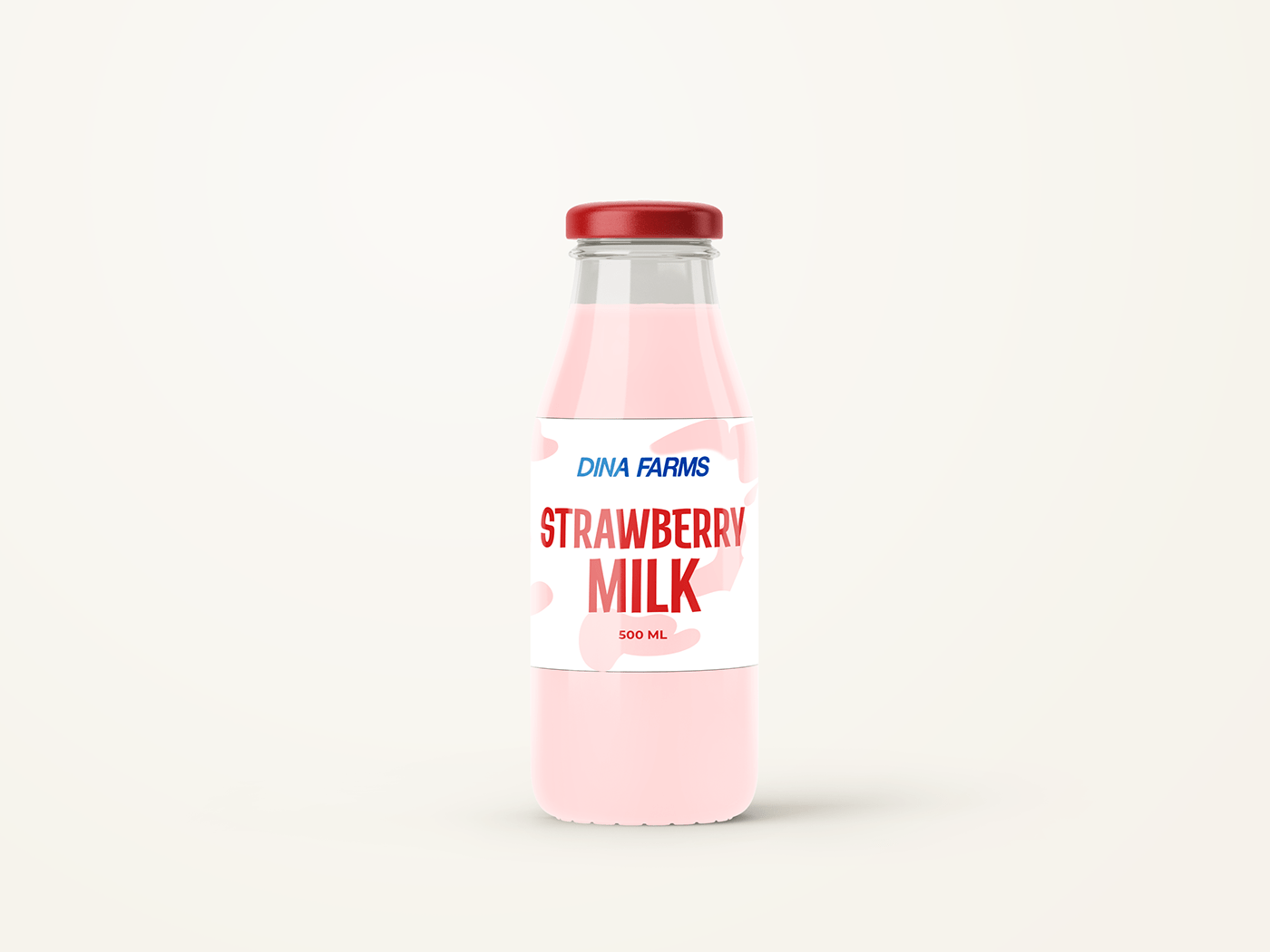
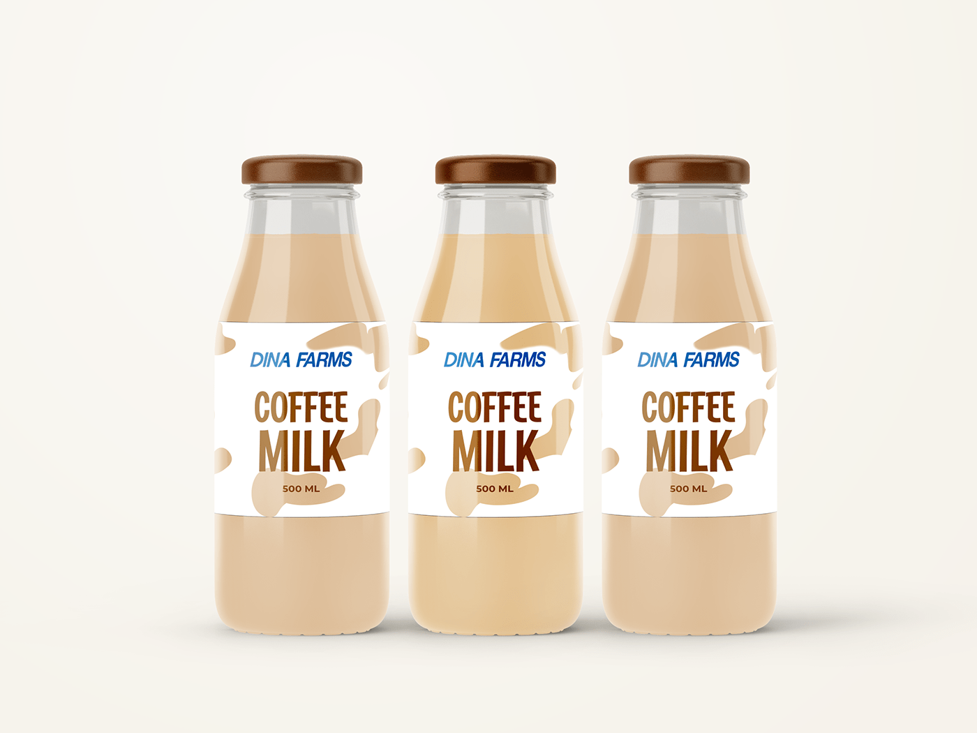
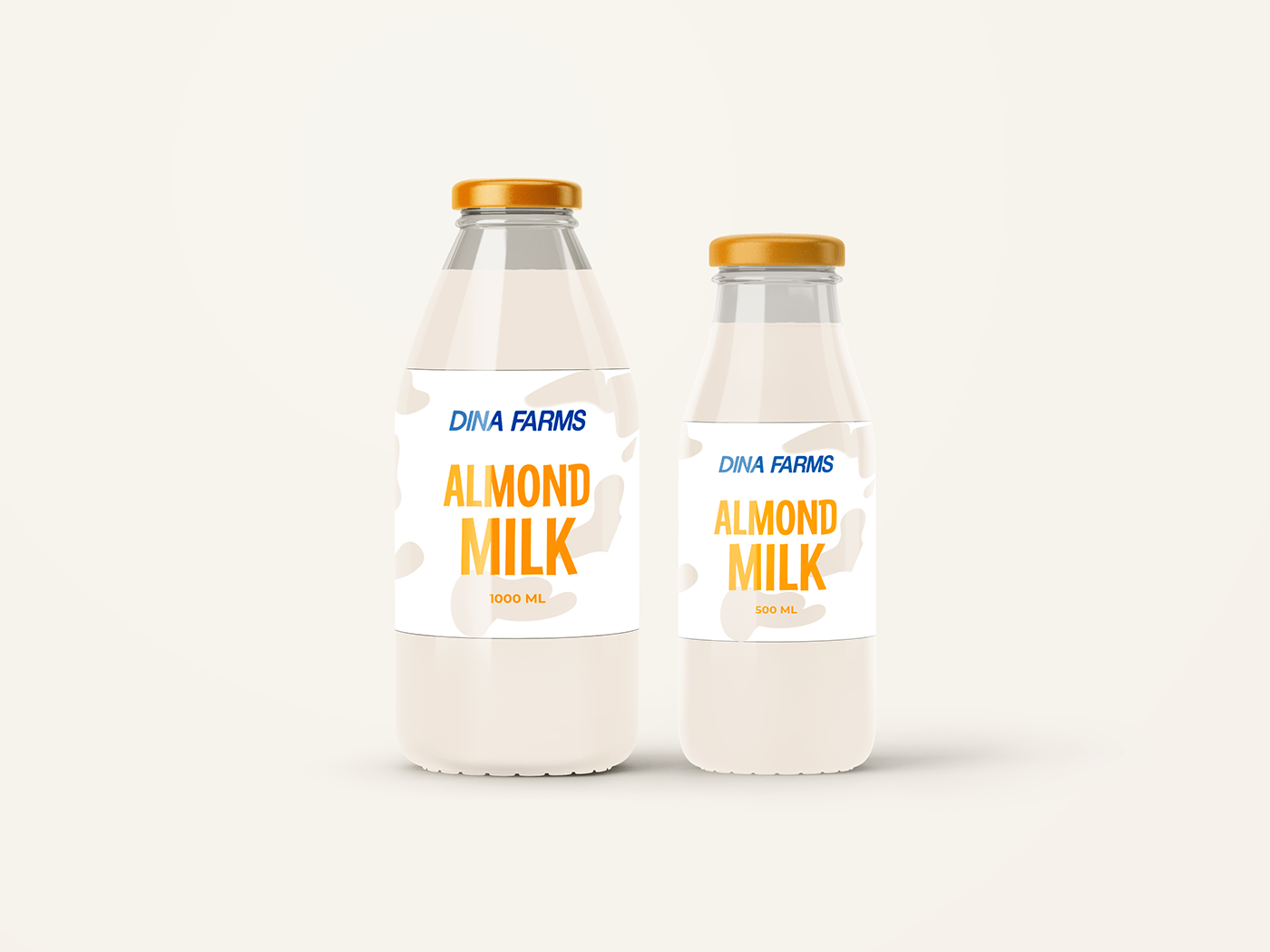
The label design on the Dina farm's Milk Bottle follows a minimalist approach. It features a clean and uncluttered layout, prominently displaying the streamlined Dina Farms logo on the front. The label also incorporates essential product information, such as the flavour name, logo and the size of the product ensuring ease of understanding for consumers.
Transparent Cow Pattern:
To further accentuate the freshness of the milk, a transparent cow pattern is delicately incorporated onto the white table color. The cow pattern adds a touch of playfulness and also serves as a subtle reminder of the milk's origin. It enhances the overall visual appeal of the bottle while creating a connection between the customer and the source of the product.
Sustainable Printing Practices:
The strategic use of a transparent cow pattern and a white table color minimizes the need for excessive color printing. By utilizing transparent areas, the natural beauty of the milk inside is accentuated, reducing environmental impact while maintaining an appealing visual aesthetic. This aligns with Dina Farms' commitment to sustainability and eco-conscious practices.
Complementary Color Palette:
The high contrast font colors are carefully selected to harmonize with the overall packaging design. The vibrant red, warm yellow-orange, and rich brown fonts create a complementary color palette that enhances the visual appeal of the product. The contrasting font colors not only differentiate the flavors but also contribute to an aesthetically pleasing packaging experience.
colors methodology
Strawberry Flavor: The word "Strawberry" is written in vibrant red font, representing the luscious and sweet taste of strawberries. The high contrast between the red font and the white background ensures immediate recognition and appeals to strawberry enthusiasts.
Almond Flavor: The word "Almond" is written in a warm yellow-orange font. This color choice mimics the natural hue of almonds and evokes a sense of warmth and richness. The high contrast between the font and the background aids in distinguishing the almond-flavored milk variant.
Coffee Flavor: The word "Coffee" is written in a rich brown font, reminiscent of the aromatic and earthy tones associated with coffee. The high contrast between the brown font and the white background makes it easy for coffee lovers to identify their preferred flavor instantly.


What do you think?
Press "Appreciate" if you love it and feel free to give me some feedback, Have a great day!


